A luxury touch for premier floral and event design.
Identity / Strategy / Web
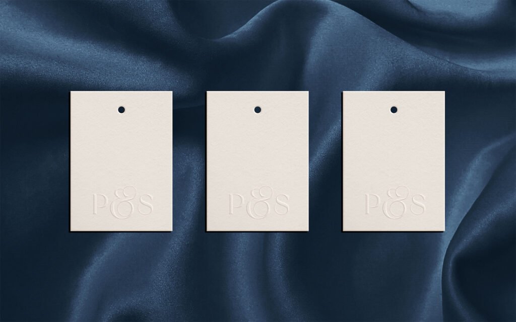
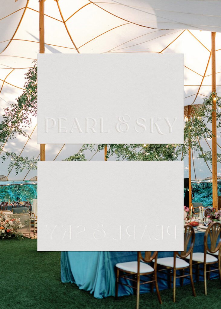
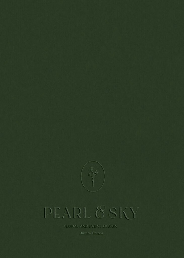
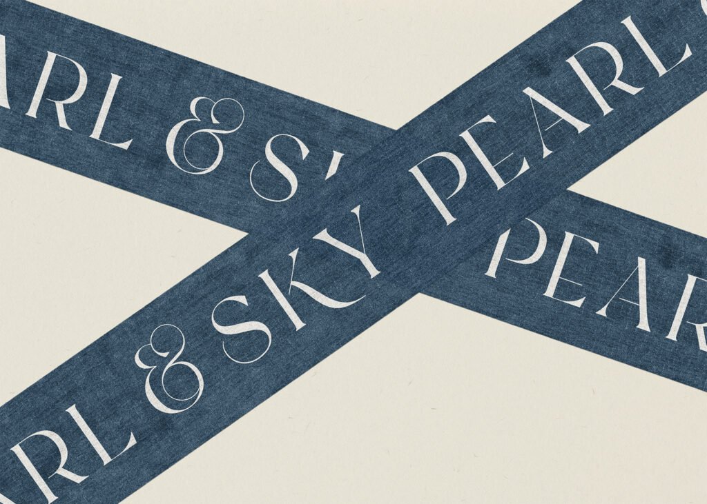
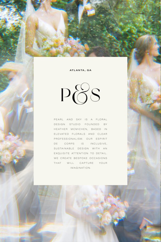
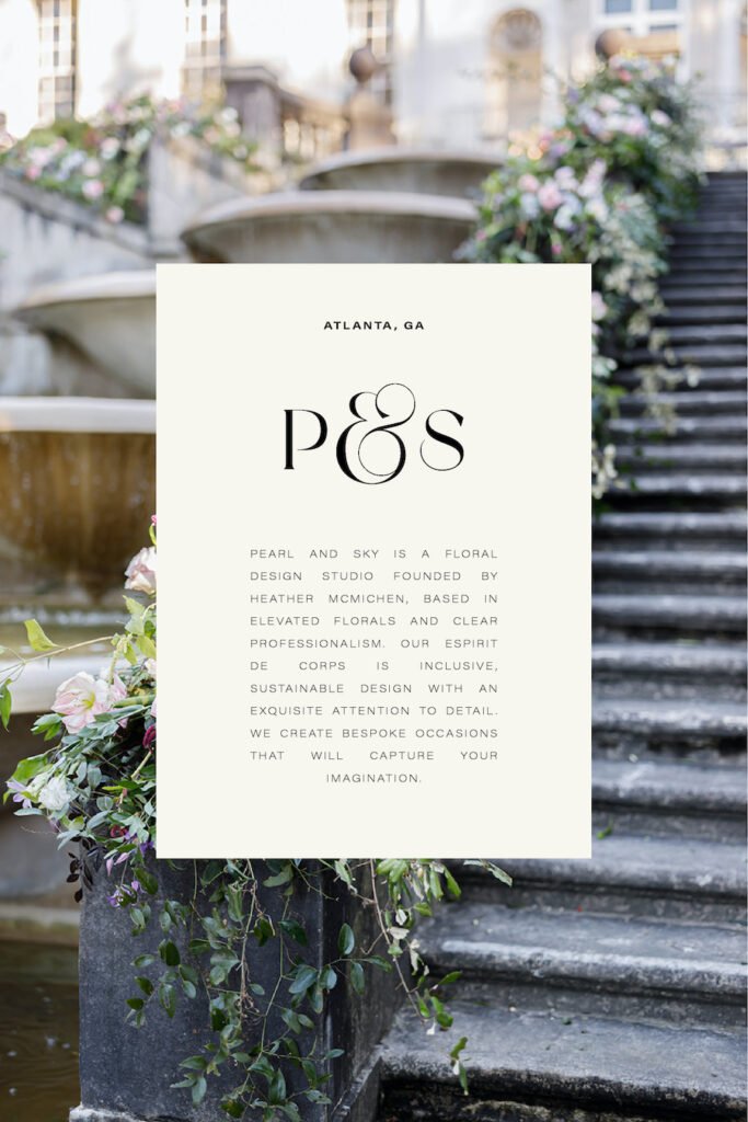
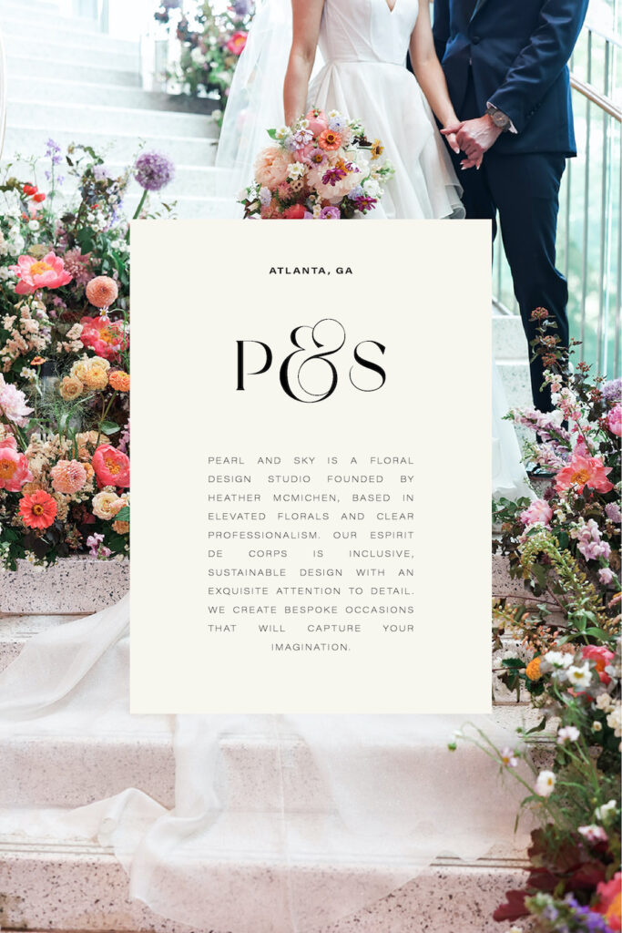
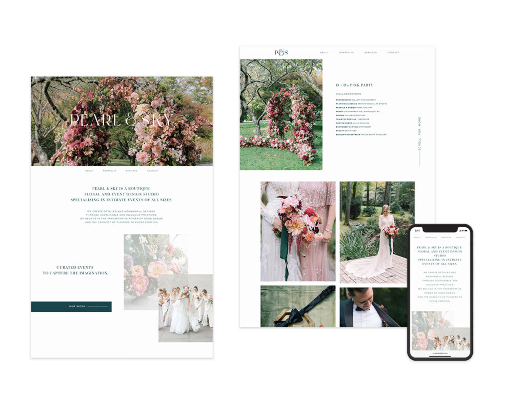
Pearl & Sky is a boutique floral and event design studio specializing in intimate events of all sizes. As the company grew, the brand needed a facelift. The new logo features a delicate, custom typeface and illustrations. The website is lightning fast, mobile responsive, and gives space for the photography to shine.
Collaborators / Studio Lyko / Pearl & Sky Events
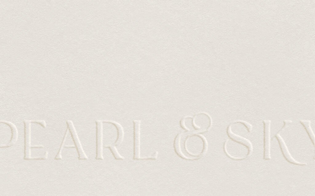
The custom-designed wordmark was a labor of love. Inspired by slender branches and vase arrangements, the letters are imbued with natural forms and gentle movements. The ampersand resembles two nested pearls.
The website gives special attention to visual lightness and balance amidst a heavy dose of florals.