Because banking is an essential service, the user experience of traditional banking groups tends to pretty poor. Smaller, challenger banks are usually more conscientious about the user experience, since customer loyalty is more directly tied to ease of use. We can see some really clean rebranding for companies like Wise, formerly Transfer Wise, that was revealed earlier in 2023.
Inspired by Peter Ramsey’s case studies over at Built For Mars, I’ve gone through my thought process while redesigning Banco Sabadell’s mobile app.
Banco Sabadell is a multinational Spanish bank and the fourth-largest bank in the country. With a base of 12 million customers, their original mobile experience leaves a lot to be desired. I started with an audit of making a transfer on the existing app. Let’s take a look.
MAKING A TRANSFER: ORIGINAL DESIGN
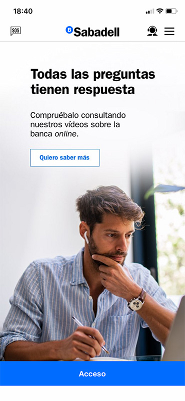
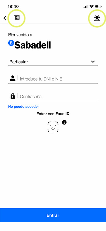
The login page is not too bad. Besides this landing screen that eats up loading time, we’ve got some corporate photography of a white guy checking out his finances. Fine.
After an unnecessary click to get to the login page, some very strange menu options appear. Why are there two separate items for an SOS chat AND a help attendant? Why do I have these options before I even login?
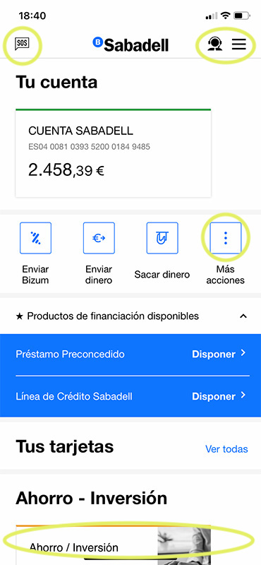
This is a classic mistake when designing for mobile: the designer will translate the desktop web design into a smaller format. Our handed-ness and thumb reach dictate how we use mobile devices. Mobile designs should (almost) always have the navigation menu at the bottom of the screen for this reason. This design has the added oddity of having major navigation items (Enviar Bizum, Enviar dinero) in… the middle of the screen?
Not to mention, we have two different expandable menus: Más acciones and a hamburger menu.
But wait, there’s more.
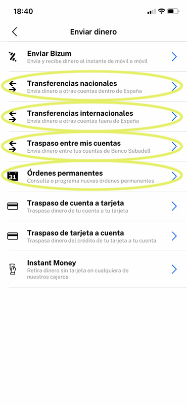
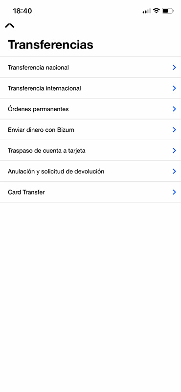
These are two separate screens, one when I select “Enviar dinero” (Send money), and another, when I select “Hacer transferencia” (Make a transfer).
Plus, wasn’t this Enviar Bizum option its own menu item on the previous screen? Yes, yes it was. And the Instant Money option? That too.
Not only do we have these actions repeating under multiple item menus, which signals a lack of content organization prior to development and a lack of attention to user flow, we have multiple clicks for different transfers: national, international, and recurring payments (all circled). Why? What if I want to make a payment now, and also schedule it for next month? How much time is it going to take to actually do this? Maybe I should just not?
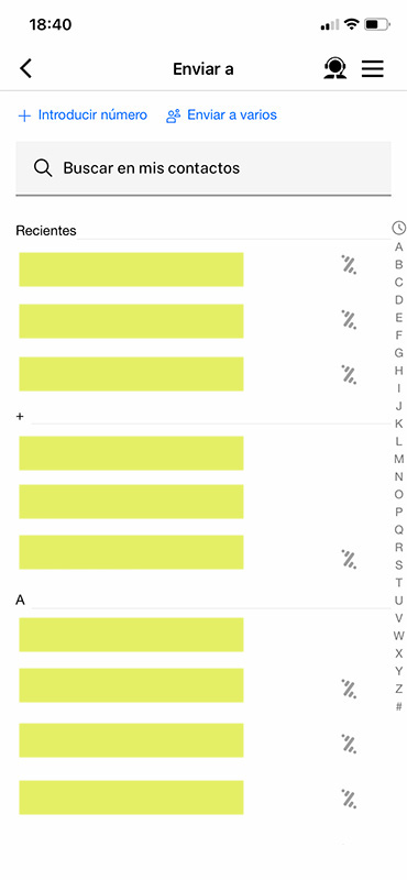
The page for sending a Bizum (the Spanish equivalent of the American Venmo) is actually pretty good. The Bizum logo indicates who is already set up to receive money, and the contact index on the right gives me an idea of how to find the correct contact.
“Introducir número” is fine, but could be more prominently displayed. This text (Input a mobile number) also doesn’t indicate if this number will be saved in the future. Even “Añadir contacto” (Add contact) would be an improvement.
“Enviar a varios” (Send to multiple contacts) is another unnecessary click. I should be able to select more than one from the beginning.
Finally, why is the hamburger menu still here? Do I need that? By clicking “Send Bizum” I’ve already indicated to the app that I’m interested in sending money. I don’t need the option to review my finances or apply for a credit card in the middle of another task. A back button is just fine.
The option to call a help attendant is still here, although if I need to call someone to understand how to send a payment, then this is not an intuitive app.
Off to the new design!
Now that I’ve got some idea of the weak points in the existing app, I sarted mocking up user flows, wire framing, and prototyping a less headache-provoking version of making a transfer.
Let’s go over why this new version is more successful.

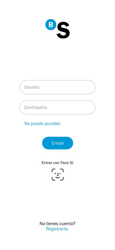
I simplified the landing screen to speed up app load time. I’ve added a branding treatment with a single, solid color that won’t add to the time it takes to reach the login screen.
The login screen has been sexified mostly–it functions the same as the original. I’ve removed the option to sign in as a Particular/Individual or as an Empresa/Business. The login function should not vary based on my account type.
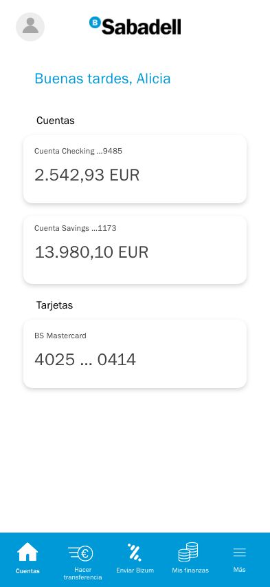
Here we’ve got a bare-bones home page. I’ve left this empty of design mostly to emphasize how the user experience has changed. We have one main menu bar located at the botton with some navigation options that I selected based on use frequency and importance. “Enviar dinero” and “Enviar Bizum”, two options in the original app, are not mutually exclusive, so I’ve renamed “Enviar dinero” to “Hacer transferencia” (Make a transfer) for clarity.
Account information is in the upper left corner; if attendant help/SOS still needs to be added after beta testing, this can go in the upper right.
We also have a personalized touch with the custom greeting.
So, let’s see what happens when we choose “Hacer transferencia”.
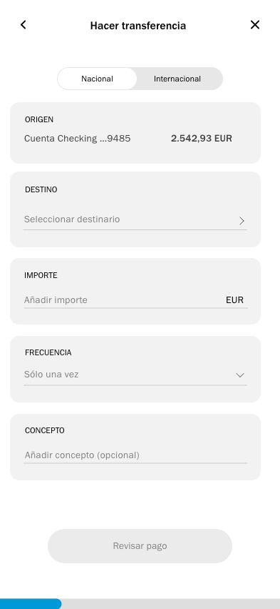
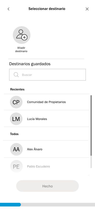
When I click on “Make a transfer”, the app actually starts to prompt me to… make a transfer. Excellent. The national/international option bar at the top allows me to choose my destination country while reducing clicks.
The checking account has also been pre-selected to reduce clicks, as it is the only account I could send a transfer from.
Note how “Frecuencia” (Creating a recurring payment) has been integrated into this task flow.
Choosing an account to send my payment to is mostly the same. I’ve changed the wording to “Destinario” in every case, rather than switching between “Destinario” and “Contacto”.
Both the gradient and the vertical bar indicate to the user that more contacts can be found by scrolling.
We also have a nice progress bar at the bottom of the screen to indicate how many more steps until I’m done.
Alright, so now I want to add my recipient:
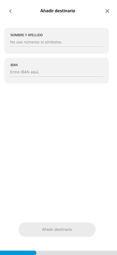
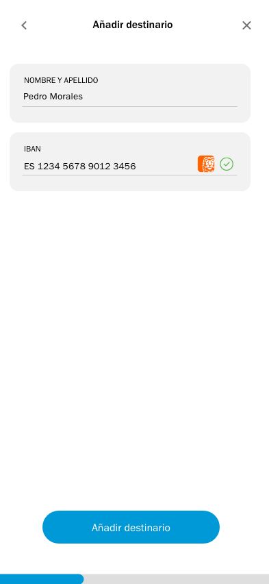
That was easy. I’ve included subtle clues to indicate to the user that everything checks out before trying to send money to a mistyped account number (IBAN). We have a green tick to indicate the number has the right number of digits, and there’s a small icon indicating that this is, in fact, an ING Bank account we’re going to send to.
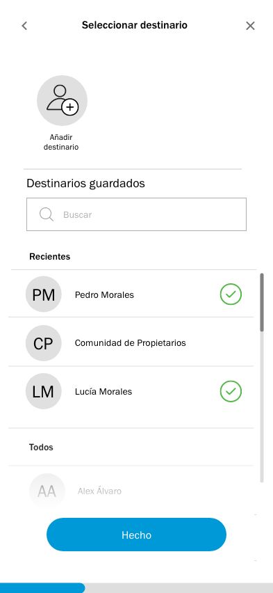
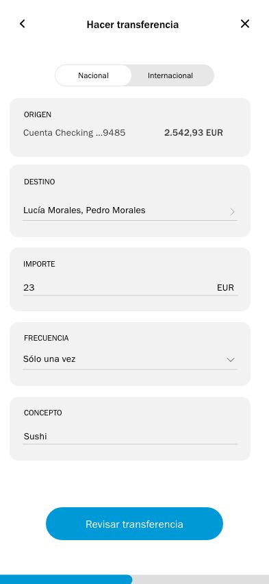
We can select as many recipients as we want. Once our sections are filled out, the button “Revisar transferencia” (Review transfer) prevents user anxiety by signalling the option to review the information.
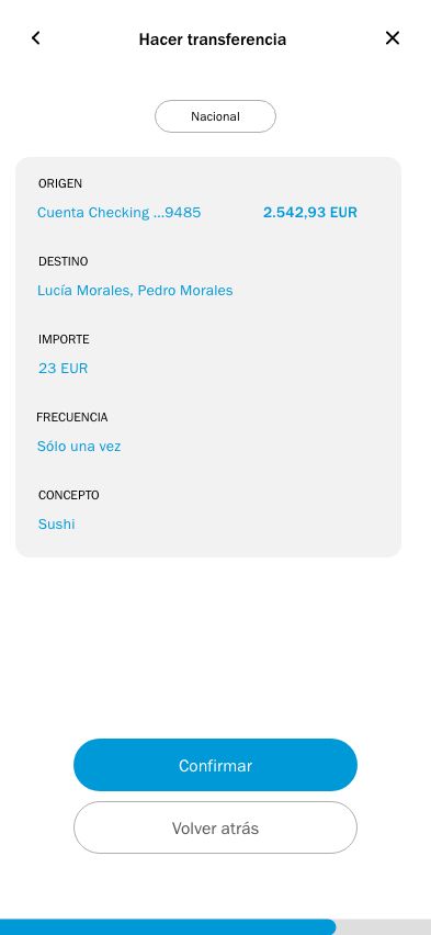
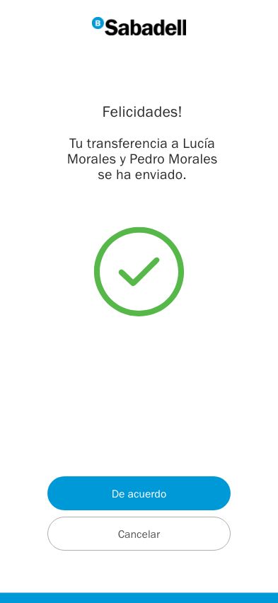
Here, I’ve aligned the “Volver atrás” (Go back) option is with the previous “Revisar” button, which reduces the chances of accidentally clicking on “Confirm.” At the end, we have a timed “Congratulations” page signaling that the transfer has been sent.
The trick is, the payment hasn’t been sent yet. If the user sees this screen and realizes they’ve made an error, I’ve included a “Cancelar” (Cancel) button. This doesn’t actually cancel the payment, but allows the user to go back and change any information before sending it out. Gmail operates under the same principle with the “Undo send” feature. If the user doesn’t click Cancelar, the payment is sent momentarily.
Reducing friction is essential to building brand assets that clients enjoy using. With this redesign, we’ve reduced the number of clicks for making a transfer, reduced the menu options for greater clarity, and added fool-proof indications to guide the user experience.
Have a project like this you need help with? Get in touch.


